
Last week saw the release of labour market data for the UK. It showed:
- unemployment at a 1975 low of 4%
- employment at an all-time high since data was collated on this basis in 1971, at 75.2% of the labour force, and
- wage inflation rising at its fastest nominal pace since 2008, up 3.4% including bonuses year on year in November 2018.
What’s not to like? Surely, this means that employees are happy with their lot and there is little for them to be disgruntled about? If only it were that simple.
What headline figures hide
Dig below the headline figures on pay, for instance, and it is not clear that all of those in work are doing as well as the headline increase in wage suggests. Sure, in nominal terms, pay (not adjusted for price inflation) has been rising at a faster pace, particularly in the past year. Nominal compensation was £494 a week in November 2018, up from £478 a year earlier, a rise of 3.3%.
The figures look even better if we go back to the start of the recession in 2008/9. Pay growth in nominal terms was £409 a week in December 2009, making the increase to November last year 20.7%.
But there has been a reported rise in in-work poverty and greater use of food banks by people that are working, according to recent surveys by various charities, so what accounts for this?
The ‘real’ versus the nominal
Real pay growth determines purchasing power in a ‘volume’ sense – in other words, if adjusted for price inflation, does the money people earn from working buy more or fewer goods and services than it did before?
On this basis, as chart A shows, real pay is less than it was pre-crisis. It is true that over the last few months real pay has indeed been rising (a combination of falling price inflation as much as of rising wages) but it has yet to make up for the fall that has occurred since the recession. At the end of 2008, regular pay (total pay before bonuses) was £471 a week. In November 2018, it was £463, a fall of 1.7% ten years on from the recession. What a difference inflation makes.

It is also true, as in chart A, that if you are not in the sort of job that attracts a bonus, as many on lower incomes aren’t, pay levels are around £30 a week lower than for those jobs that carry a bonus. Admittedly, a drop of 1.7% off the peak level of weekly pay is still a rise of 4.8% from the £442 post-recession low regular weekly real pay recorded in March 2014 but that’s very unlikely to be how most people see it. Also, pre the crisis, real pay on average rose some two percentage points faster than prices each year, meaning that stagnation represents a cut every year of 2% in real pay. Over a decade that adds up to a 20% fall in living standards, which is quite staggering when seen in those terms.
Hence, a fall or stagnation at best in living standards such as suggested by the profile of real pay since the recession would inevitably have led to some disgruntlement on the part of those affected, I would even go far as to say that a political backlash, as in any similar economic downturn in the past, is much more likely than not.
The impact of monetary policy
But something else occurred in the economy alongside the fall in real pay that makes any reaction by those affected potentially more potent and sharper than it would otherwise be.
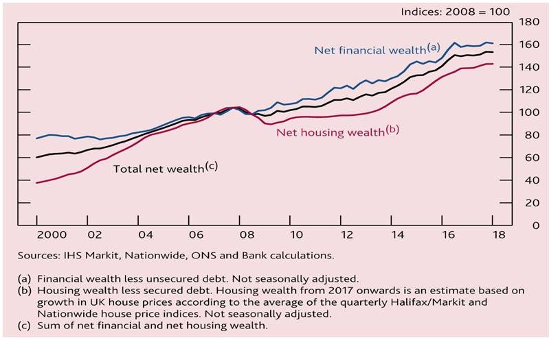
Figures compiled by the Bank of England of changes in net financial wealth since the recession, excluding secured debt but including holdings of bonds, equities, housing etc., show a staggering increase, see chart B. Total net financial wealth is up over 60%, with housing wealth up by around 40%. Returns for bondholders and holders of equity wealth were higher than for those who ‘only’ held housing wealth.
Part of the reason for this is the side effect of quantitative easing (QE), government purchase of mainly government bonds which pumped massive amounts of liquidity into financial markets, a large proportion of which found its way into financial assets. In the case of the UK, QE amounted to £435bn. Around the world (US, EU, Japan etc.) the QE total is estimated at some $14trillion.
Sharp cuts in nominal official short-term interest rates to historic lows (UK bank rate was held at a 316 year low of 0.5% for roughly a decade) also boosted returns for holders of financial instruments.
A global paradigm
The point of this analysis is not to criticise the policies enacted to deal with the financial and economic crisis of that time, but merely to point out that returns for those with access to wealth and for those with access to average incomes have seen significantly different outcomes. This gap, as a result, may be having political and social consequences that are not at all surprising in the context of this analysis.

Indeed, the surprise is that many commentators are surprised. The political reaction – distrust of mainstream politicians, mistrust of ‘established’ figures (as opposed to establishment ones) appears to be similar across a range of countries – and may be uncoordinated and messy. After all, as chart C shows, weak or declining real pay in the last decade or so is not just a UK phenomenon so why should we expect the reaction to be?